Are you trying to find ways to catch up with the competition or trump them entirely? There are a lot of powerful marketing techniques you can use to gain a competitive edge. One of the oldest and most effective tools at your disposal is the business sign. A business sign can share any number of messages about your business, your store, your brand, or any events associated with them.
It’s often true that the biggest and best companies have the most recognizable and interesting signs. Those signs helped those companies reach the top by attracting consumers, building brand awareness, and improving trademark recognition. Here are a few pointers you can use to design and utilize business signs that will help you trump the competition.
1. It Needs To Make Sense
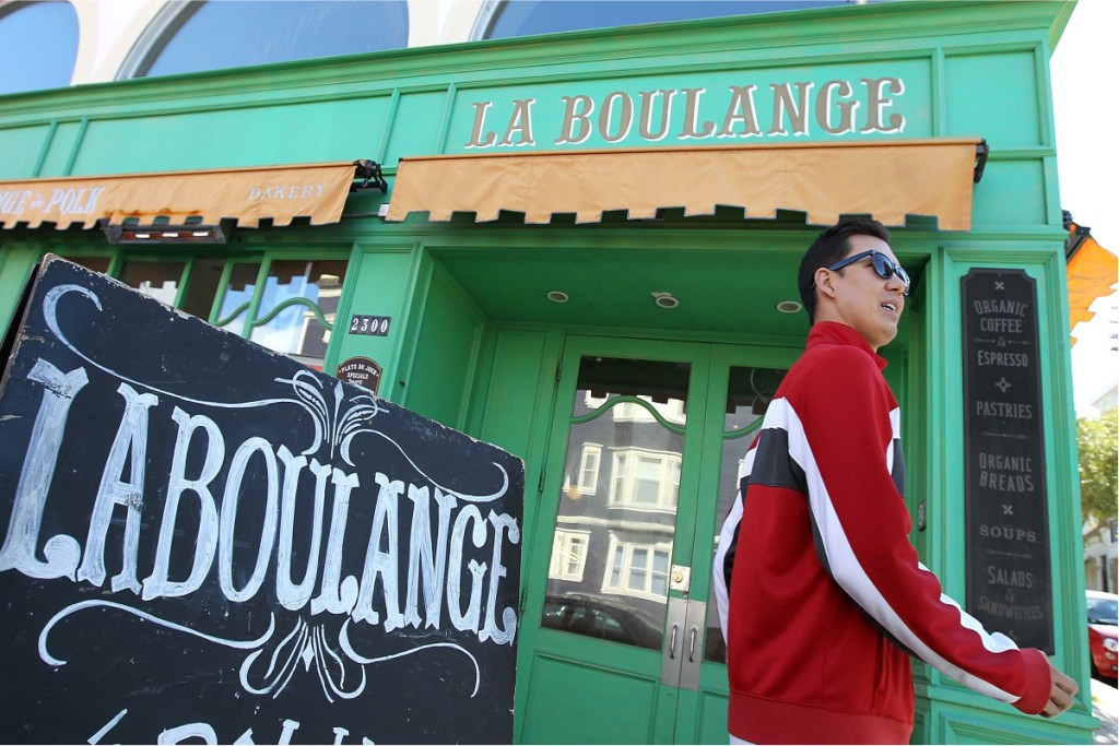
 This sounds obvious, but you might be surprised by the number of oddly worded and overly complex business signs floating around. In many cases, business owners try to be too clever or creative. The end result is a sign that doesn’t make much sense to most people. A message on a sign needs to be short, simple, to the point, and easily understood by the masses. The goal should be to capture the attention of consumers and tell them what they need to know while using as few words as possible. The same applies to colors and design elements. A crowded and confusing sign isn’t going to encourage people to learn more about your brand. If anything, it’s going to cause you to lose more business than it gains. Take a look at the sign above. Simple, modern, elegant and it suits the brand. You wouldn’t use this graphic or approach on a bank, but for a Wine, Expresso Bar, it’s perfect.
2. Choose Key Features To Highlight
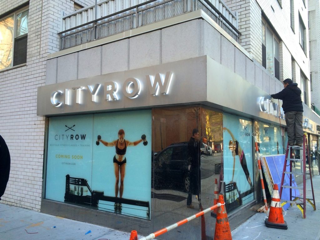 This can vary according to the purpose of the sign. However, there is usually one or two key features or attributes that you are trying to highlight with your sign. Limit that sign to only those two attributes. It doesn’t need to list every benefit of doing business with your company. It also doesn’t need to list benefits that are already commonly associated with your market. Every sign needs to have a strictly designated purpose. It’s always better to have five signs sharing five different messages than to have one sign sharing two messages. Though, when investing in multiple signs, remember to consider placement so that one does not distract from another.
3. Winning The Game Of Colors
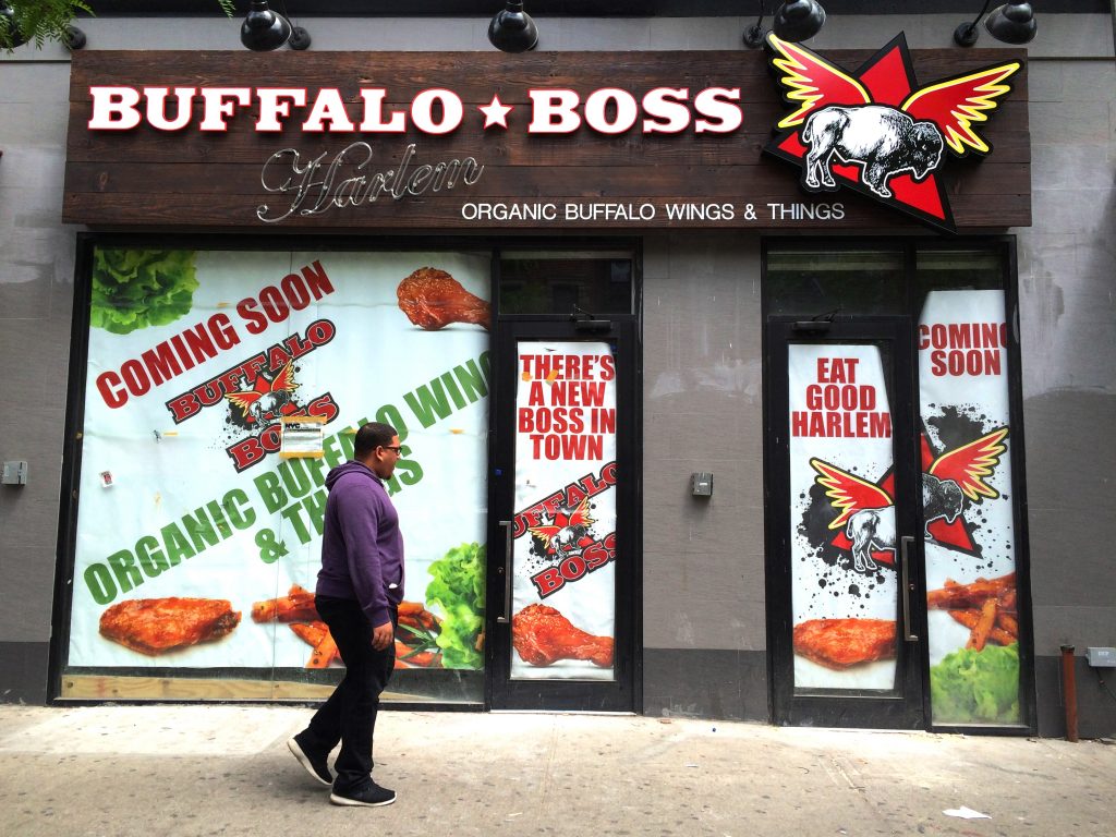 Choosing the message for your sign isn’t the only difficult task. You’ll also need to choose an appropriate color scheme. You and your competitor could have a sign with the exact same message, but the one with the better color scheme is the one that is more likely to be noticed. If you want to trump the competition in your market, then you need to choose colors that grab the attention of consumers. The colors are often influenced by the color of the brand as well. Using colors associated with your brand helps increase brand awareness and trademark recognition. The last thing you want to do is use colors associated with a competitor’s brand so make sure you do your research before picking your colors. Ideally, you want a high level of contrast between the shapes, sizes, colors, and locations of the various elements on the sign. This usually includes the text, any graphics, and the background color. You don’t want the color of your text to blend with the background color or the colors on the graphics. Each element and its color must be chosen carefully and its relationship to the other elements must be considered.
4. Testing The Sign
 Remember that everybody makes mistakes. It’s a good idea to continually test the effectiveness of your signage to determine if it’s working or if it needs to be modified. You can do this by asking people, “Where did you hear about our business or promotion?”. Use this information to determine how many people are learning about your business or special events because of your signs. If the number is extremely low, then it may be time to return to the drawing board and improve your business sign.
After you’ve designed a handful of signs you’ll feel a lot more comfortable with them in the future. You’ll be able to quickly draft the appropriate wording for signs for events, sales, and new products. The ability to quickly advertise with impactful signs will help you trump the competition and dominate your local market.
NYC Signs and Awnings is a professional sign design company.
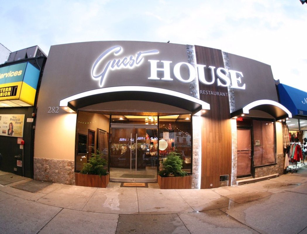 Our in-house graphic design team works directly with our manufacturing team to ensure that your unique graphics, logo, colors, and lettering are expertly crafted into an eye-catching sign design that provides a clear message to your customers. We can also help you decide how much wording or what important points to highlight and include in your sign based on our years of experience in crafting custom signage. We create high-quality permanent and seasonal custom signage that will expertly advertise your business, restaurant, event, or special promotions. Let us handle all the details so you can focus on your business. Call us at 212-461-1625 or fill our online form to request a quote today.
