A majority of businesses these days are bombarding customers with advertisements using signs and graphics. However, many just focus on the content without paying heed to the cardinal signs and graphics elements such as fonts and colors. As a business owner, you must understand that your branding is one of the only things by which your customers remember you by. You must make sure your message, fonts and colors are consistent across all channels – visuals such as your signs and graphics, social media accounts, and your business website. So, if you are going to use the same fonts, colors, and style, you had better make sure it’s the right one.
In this series, we’ll discuss how to choose a relevant font, color and style and why it is critical to the branding of your business.
The first part of this series deals with fonts. The following are several points to keep in mind when choosing a font for your company name and logo:
The first impression is often the last impression
Think about a few famous well-known brands for a moment. Whether it is Starbucks, Subway, Netflix, Google or you immediately picture the word and logo as you have seen it over and over again. Not only do you picture the colors and image used in these logos, most likely you are picturing the actual company name in its typical font style. In fact, some brands don’t even use an image; their logo is the company name itself in a recognizable and unique font. These big brands are using unique fonts that have actually become their corporate identity or branding strategy. It takes but a moment to glance at a font and recognize if it is playful, scary, serious, creative or has some other aesthetic characteristic that represents a universal feeling. This is how people will feel about your logo and font as well. In this very first impression, they will develop a feeling or sense of your company and that feeling will go wherever your brand goes.
Your logo or name will reinforce a feeling about your business’ tone and style
Leave aside your business’ products and services; it is your brand’s font that will set you aside from your competitors. There are thousands of fonts out there in the design space, and it is not easy to decide which one to choose for your business.
Believe it or not, fonts do have a substantial impact on the message you’re trying to convey through your signs and graphics. As mentioned above that first impression will carry on and persist in peoples mind. Moreover, it should be clear, easy to read, and in sync with the tone of your business message. So, if you want to be playful, fun and creative, choose a font that is whimsical and unique and that reflects these particular feelings. If you want to convey a sense of authority or conservativism, a font that is more stoic is probably your best options. Whatever your brand’s message, choose your font to match.
Some fonts are soft and cool, while the others are loud and bold. Some are straight and simple, while the others are decorative and whimsical. Take a moment, imagine your brand, and think which type of font will go well with your brand’s messaging and tone. Also, don’t forget to take your audience into account. Is your business targeted at children or the elderly? For instance, can you imagine a clinic’s signboard with a funky, decorative font? Well, no one can, and that’s exactly what we’re talking about.
A logo is meant to be simple and easy to read
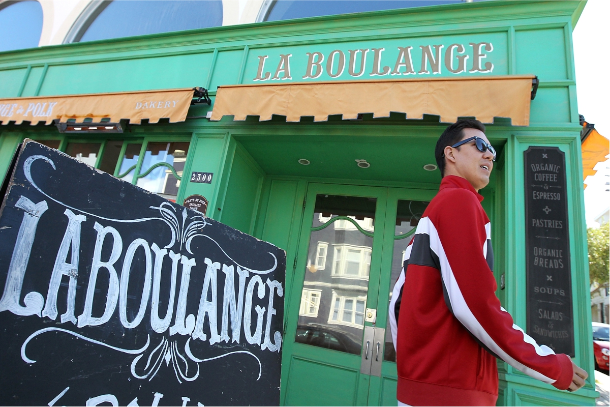
Since signs and graphics are used to communicate with customers, you need to make sure the font is readable and easy to comprehend. It needs to be large and clear enough for the crowd to read easily. Also, make sure you choose a background that compliments the font to enhance its readability. Too often people choose an ornate font that they may feel matches the company feeling (i.e. fancy, artistic, pretty, etc.) and then discover that the majority cannot read the font clearly on first glance.
Designing for people means involving people
If you have been pouring over fonts for hours and deeply involved in the decision process, you may not realize how easy or difficult something is to read. You may also be more aware of the various font styles and see nuances in them that perhaps others don’t see. People are unique and this is good for you as a creative professional, but be sure to survey the masses when choosing a font. You don’t want to pick something that you think screams reliable when the rest of the world thinks it conveys sloppiness. So, once you’ve narrowed down some choices it’s best to get a group of non-biased folks together and show them a few of these font choices. This is generally called a focus group, but it can simply be a group of some friends and family. If you are already in business you can also just survey those current customers and clients. Ask them if they can read the logo on first glance. Ask them what feeling it conveys to them. Get them to vote on their favorite logo and lettering. Ultimately, the decision is yours to make but getting outside feedback can be quite an eye-opening experience.
Need customized signs and graphics for your business? Get in touch with us!
If you’re looking for impactful signs and graphics for your business with the perfect fonts and themes, we’re here to help. At New York City Signs and Awnings, we provide signs, graphics, and awnings for all kinds of businesses. Whether you’re a restaurant, an office or a medical service provider, you can get in touch with us for all your signs and graphics requirements. Our professional graphic design team is highly experienced and can help you make the right choice for your business. Remember, a first impression can last a lifetime so you want to be certain you are conveying the right message to make this impression a positive one.
Ready with a basic idea? We’ll do the rest. Request a quote today, and we’ll get working.


